Market Research / Empathy Research / Analysis / Workshop Facilitation / Wireframes / Design Solution / Usability Test
Category
SaaS / Booking application
Timeline
June 2022 - August 2022
Team
Product Manager, UX/UI Designer
Making Golf Booking Friendly
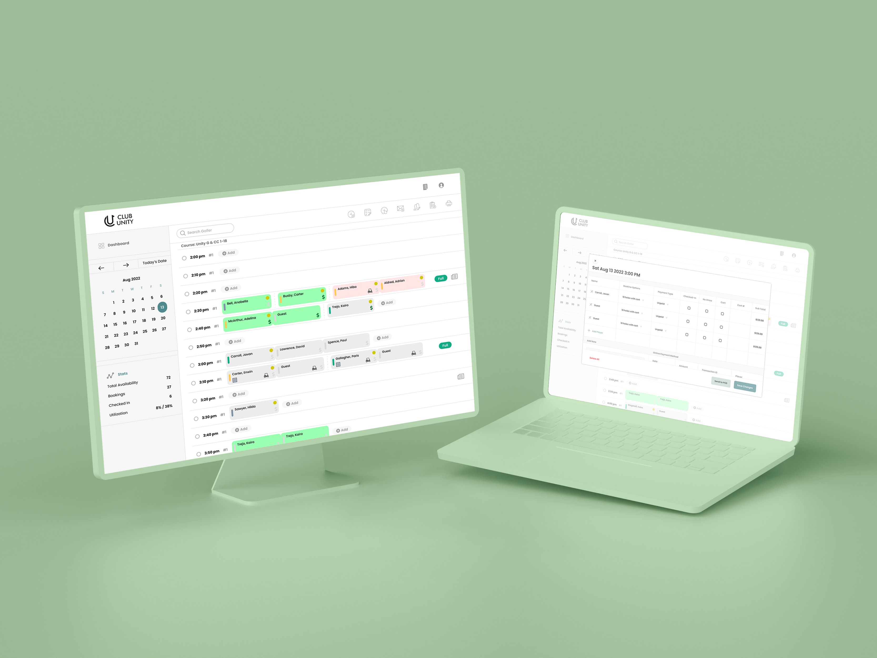
Club Unity is an established software company based in Calgary that provides a complete suite of club management software for golf courses and private clubs. As part of a capstone project, they allowed us access to a client to conduct user experience surveys for the purpose of uncovering potential improvement to their booking system's user experience.
We chatted with the client about everything, from their business prospects to their desired outcome of this project. We talked about their needs, which was for us to explore the potential of improving their system. They knew their system needed maintenance but were unsure how to tackle the user experience. Coming into this project, I did not know about golf rules and how people book tee times. Despite not knowing anything about the sport, I used my expertise in user-centred approaches to understand how golfers make decisions when booking tee times.
Market Research
The Claim
During Covid-19, participation in casual and competitive golf resurged. Golf clubs all over North America discovered that their archaic systems for booking tee times could not handle the boom in play, leading some problem-seekers to look for cloud-based solutions.
The Problem
Calgary experienced this resurgence throughout 2021 and 2022, causing many golf clubs to scramble for solutions. Because this is a new problem that emerged post-covid, there weren't many reasonable solutions in Canada.
sdfsd
Empathy Research
Our first step in the pipeline was to conduct interviews with people already using the Club Unity system. We visited the Sorocco Golf Club, a Calgary-based golf course integrated with our client's product, and interviewed the staff and club members about their booking experience. Their responses provided fascinating insights about their behaviour and pain points. Below highlights a summary of their responses.
Survey
In our survey, we asked, "what causes you to call the Sirocco Clubhouse."
We received over 200 responses, and the results were insightful and correlated with our qualitative findings. Golfers often call the club to book tee times, modify their current booking, or cancel their reservation. The fourth-highest increase points at issues with the booking system, addressing user issues with the product.
Golfers calling to book a tee time is a problem as users don't depend enough on the Club Unity system to make bookings or modifications to their current tee time.
Key Observation
The staff and members are experiencing communication and user issues with the Club Unity system. The staff desires a reduced call volume by getting members to use Club Unity, but the members are having problems using the booking application and rely on the expertise of the staff for help.
dsfsdf
Analysis
After gathering user data from Empathy Research, I used affinity mapping to categorize the data into emergent themes. Using the insights from this process, I created a few personas to help me better understand the demographic and their problems. I also made a Customer Journey Map to understand the stages the customer takes to complete their desired tasks. Lastly, I conceived a Point-of-View statement to condense the research and analysis into a simple declaration.
sdfsdf
Customer Journey Map
In creating the customer journey map, I could outline the steps users will take to reach their desired tasks with the product. I could also present their experiences in each step of the journey, including what they feel, do, and think. This process provided an understanding of how well the current Club Unity system works with its customers.
sdfsf
Point-of-View Statement
With the POV, I could condense the research and analysis into a declaration. This process allowed me to quickly understand the user and their need, providing me with a "north star" to guide the rest of the design process. The POV statement takes the user's perspective and outlines who they are, their deep need, and any other helpful insight about them.
Workshop Facilitation
With our POV statement, we could determine the appropriate problems and solutions to test and validate. I facilitated my first workshop with the product manager to define the problem using How Might We questions. I've highlighted the prioritized questions from our workshop, which we arrived at using dot voting.
The prioritized questions can facilitate six different ideation sessions, each leading to different yet parallel design solutions. For now, we focused on answering one question: How might we increase the use of the online booking system and thereby reduce calls to the pro shop?
The second workshop aimed to answer the question above. We generated ideas using Crazy 8's technique and affinity mapping to discover common themes. This process helped us develop a solution statement that will prepare us for user story mapping and prototyping.
sdfsfs
Hypothesis Statement
We believe that creating a seamless and intuitive booking/modification experience for Brad will reduce his likelihood of calling the Sirocco Golf Club.
sdfssdsff
User Story Map
After framing the Hypothesis Statement, I used a USM to see how our hypothesis could work in detail. This collaborative process allows us to map the user's actions and visualize the solution. The user story map takes the perspective of the product and aims to guide the planning and implementation of features and functionality to solve users' problems.
sdfdsfsdf
Wireframes
I transcribed the details in the user story map into low-fidelity wireframes, using arrows to indicate the flow and functionality of the design in progress.
sdfsdf
Design Solution
The Minimum Lovable Product (MLP) is a tee time booking system designed to be accessible for all users with an emphasis on older demographics who make up the majority of casual golfers. The design solution is easier to comprehend with improved typography and button layout.
sdfsdfsdf
Make Bookings
The bookings page is where golfers will land when reserving tee time slots. On this page, they can interact with the three desired tasks: book tee time, modify players, and change tee time slots.
The new design offers an easier comprehension of the booking process by displaying a more apparent hierarchy using font gradience, bolded CTAs, and white space.
sdfdsfsdf
Modify Tee Times with No Hassle
One of the most requested functionalities in our research stage was the ability to modify tee time bookings easily. The modify function is nested on the right side of the page so users can navigate to it without hassle. Golfers can easily add more players to their current reservations.
sdfsdfs
Change Tee Time Slot
Like the new modify functionality, golfers can now easily change their tee time to a newer slot subject to availability. With these three main tasks easily accessible, golf pros should see a reduction in calls from their members
sdfsdfsdf
Usability Test
I tested my prototype with six different users, asking them to perform three main tasks: reserve a tee time, modify players and change the tee time slot. I also used a System Usability Scale to test and measure the usability of my design. The scoring average was 92, indicating high usability performance. However, the one commonly suggested improvement was replacing add-player forms with an "add player" button. The reasoning was users were a bit confused about whether or not to fill out all player forms. The image below demonstrates that change, but due to time constraints, I could not implement the changes for delivery.
dfsdfsdfds
Learned Lessons
We presented our discoveries and results to a panel of tech professionals at SAIT, which included our clients at Club Unity. We were credited for our findings and solution. The client showed enthusiasm and mentioned that our results revealed problems of which they were unaware. Club Unity is now in the process of implementing our solutions as they continue to grow their company.
Coming into this project, I didn't know much about golf and tee time reservations. Since completing the project, I've developed an understanding of how golf bookings work. A mentor mentioned that in UX, designers don't need to know all about a specific practice like golf to make a great product. As long as you empathize with the users, whomever they may be, the proper solutions will reveal themselves.
